

How to Make Good Figures for Scientific Papers
Learn More About Simplified Science PublishingCreating good figures for scientific publications requires using design best practices to make each figure clearly show the main point of your data story.
This article reviews important design principles that will help you create effective figures. However, if you want step-by-step tutorials on how to create the scientific illustrations and Excel graphs using Adobe Illustrator and PowerPoint, read these articles instead:

Four Rules to Create High-Quality Figures
The best data visualizations for scientific papers use a combination of good design principles and storytelling that allows the audience to quickly understand the results of a scientific study. Below are four rules that will help you make effective research figures and save you time with the final journal formatting. There are also practical tips on how to find the purpose of your figure and how to apply design best practices to graphs, images, and tables.

Rule 1: Clearly show the main purpose to your audience
For every graph or figure you create, the first step is to answer the question: what is the purpose of my data? Clearly defining the main purpose of your scientific design is essential so that you can create and format the data in ways that are easy to understand.
The most common purposes for scientific publications are to explain a process or method, compare or contrast, show a change, or to establish a relationship. Each of these purposes should then lead you to select graph types. For example, if the goal of your figure is to explain a method, you will likely want to choose process-focused graph types such as flow charts, diagrams, infographics, illustrations, gantt charts, timelines, parallel sets, or Sankey diagrams. Below are examples of the most common graph types that you can use for different data purposes. Read more articles to learn how to choose the right data visualizations and data storytelling.

Rule 2: Use composition to simplify the information
After you define the purpose of your graph or figure, the next step is to make sure you follow composition best practices that make the information clear. Composition best practices include following the journal rules and formatting from left to right, top to bottom, or in a circle. You should also review your designs to remove or adjust distracting data, lines, shadows, and repeated elements. Applying good composition means spending time reviewing your layout and simplifying the story using these techniques.
Data Composition Best Practices:
- Design flow should be left to right, top to bottom, or in a circle
- Make sure most important data is the focus of the design
- Remove or adjust excess data and text
- Make text easy to read
- Reduce contrast of bold lines
- Remove repeated elements
- Remove shadows

The example below shows how to design a figure that applies the composition best practices by taking an initial layout of a figure on the left and then use formatting to fill the space, simplify information, and reorder the data to more clearly show the main purpose of the research.

Follow Science Journal Formatting Requirements:
In order to organize the graphs, charts, and figures, you will also need to know the requirements of the scientific journal. You will need to know the limits of the figure sizes, the maximum number of figures, as well as color, fonts, resolution, and file type requirements. You can find different journal requirements by going to the Journal’s homepage and then finding the link to the author’s guidelines from there. If you Google the journal’s formatting requirements, make sure you find the most up-to-date page.
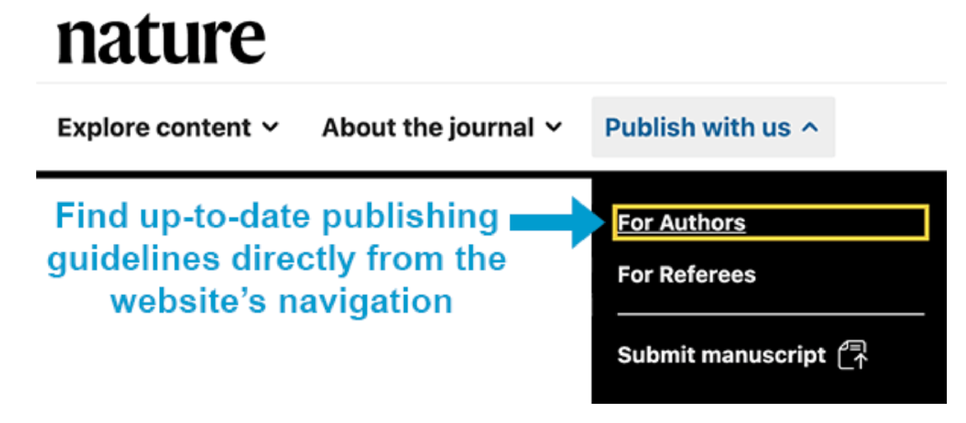
For example, the academic journal Science allows a maximum of 6 figures and requires that they have a width of 55 mm (single column) or 230 mm (double column). In contrast, the journal Nature only allows 3-4 figures or tables with maximum widths of 89 mm (single column) and 183 mm (double column). If you planned to submit your scientific publication to Nature, you would need to carefully plan which graphs and tables will best tell your scientific story within only four figures.
Rule 3: Use colors or grayscale to highlight the purpose

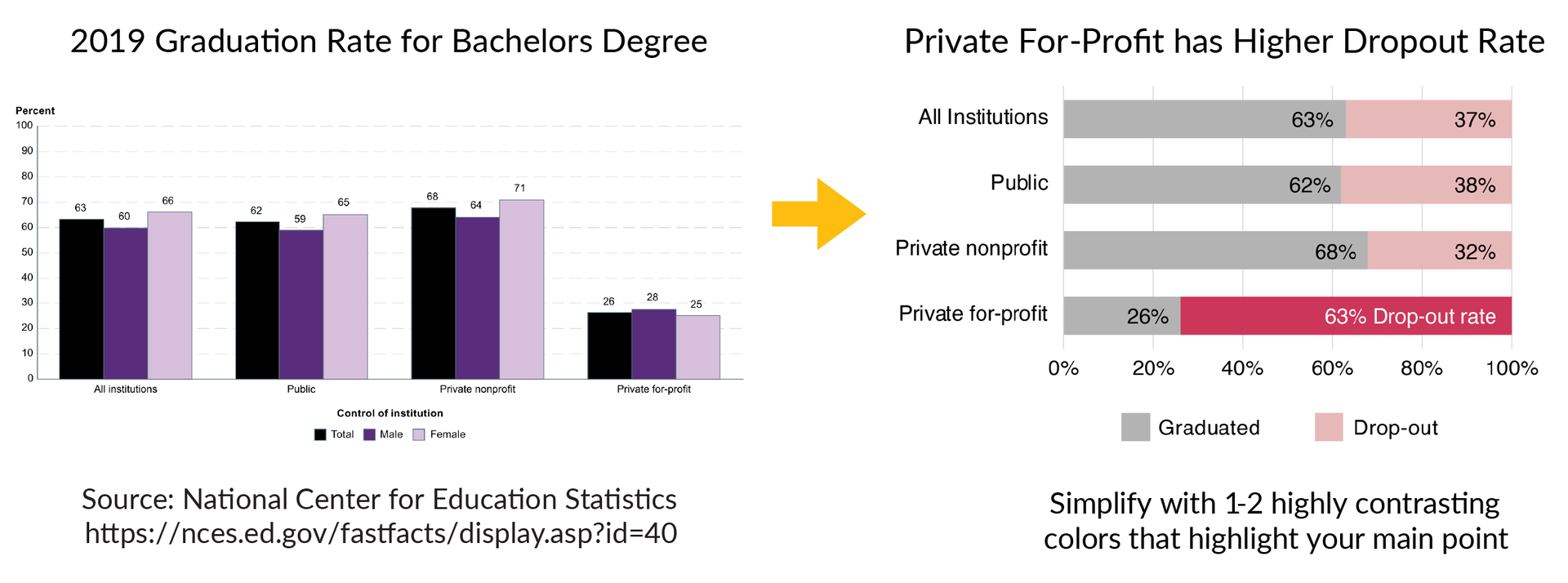
The example below shows a graph on the left that has a lot of information about graduation rates for bachelor’s degrees in 2019. The text is small and the color design makes it difficult to understand the main results of the data. One way to improve this figure is to use colors to highlight the main story of the data, which is that private for-profit institutions have a much higher drop-out rate than all other institutions. The figure on the right improves this design using the bold pink color and clearer text to highlight the main point of the dataset.
Rule 4: Refine and repeat until the story is clear

Design Clarity Checkpoints:
- Checkpoint 1. Does the figure show the overall story or main point when you hide the text? If not, improve the data visualization designs to more clearly show the main purpose.
- Checkpoint 2. Can you remove or adjust unnecessary elements that attract your attention? Remove repetitive elements, bounding boxes, background colors, extra lines, extra colors, repeated text, shadows/shading, either remove or adjust excess data, and consider moving information to supplementary figures.
- Checkpoint 3.
Does the color palette enhance or distract from the story? Limit the use of color and pick a color palette that improves audience understanding of the main purpose of the figure. If the color doesn’t serve an obvious purpose, change to grayscale.
Scientific Figure Design Summary
For every scientific publication, follow the four rules of good scientific figure design to help you create effective graphics that engage and impress your audience:
- Clearly show the main purpose to your audience
- Use composition to simplify the information
- Use colors or grayscale to highlight the main points of the figure
- Refine and repeat the process until the story is clear
Create professional science figures with illustration services or use the online courses and templates to quickly learn how to make your own designs.
Interested in free design templates and training?
Explore scientific illustration templates and courses by creating a Simplified Science Publishing Log In. Whether you are new to data visualization design or have some experience, these resources will improve your ability to use both basic and advanced design tools.
Interested in reading more articles on scientific design? Learn more below:


Content is protected by Copyright license. Website visitors are welcome to share images and articles, however they must include the Simplified Science Publishing URL source link when shared. Thank you!