Scientific Data Visualization Tools and Techniques
Learn More About Simplified Science PublishingData visualizations are a powerful storytelling tool that make information accessible and actionable.
Data visualization is the art and science of communicating complex information in simple ways. This article provides tools to help you choose the right graphs and improve your scientific visualizations. You can also practice these techniques by following along with the free online courses linked below.
What is Scientific Data Visualization?
Scientific data visualization uses graphs, charts, and images to communicate scientific research. There are many different ways to represent data and it is important to choose the right graph and chart types that make the data easier to understand. Poor data visualization choices can lead to designs that confuse your audience or make them ignore the results of your research. Below are data visualization tools to help you determine your purpose with example charts and graphics.
Data Visualization Tools
Tool #1: Data Visualization Checklist
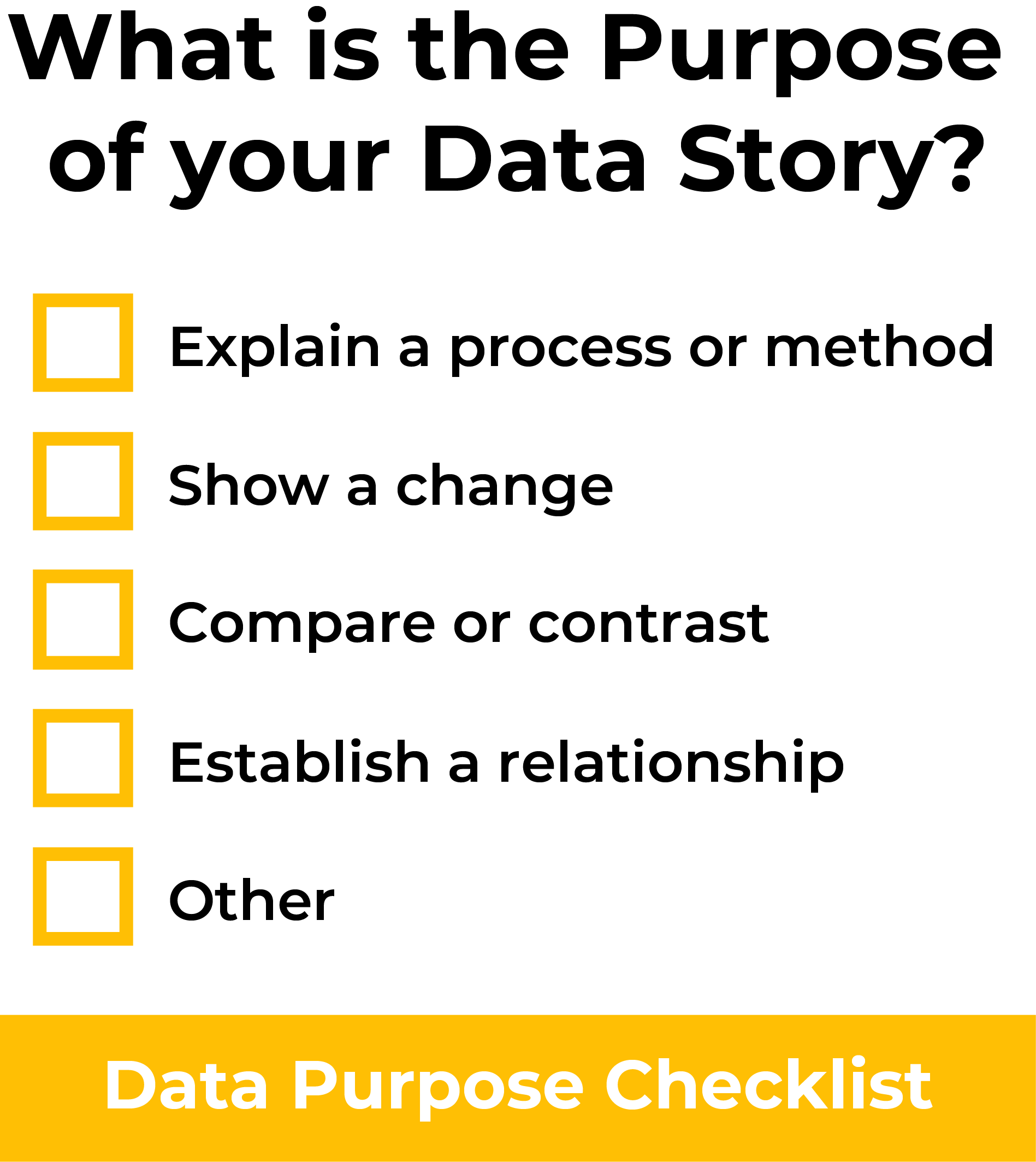
One of my favorite data visualization tools is the Data Purpose Checklist. This is a checklist that provides a helpful framework for deciding the main purpose of your data, which can help you choose the best graph style and make design decisions that matches that purpose.
The checklist has five main purpose categories: explain a process, compare or contrast, show a change, establish a relationship, or other. With any dataset, you should ask yourself the question: what is the main purpose of my data story? And then select one of these categories. Any data visualization you make should then be focused on clearly showing the selected purpose.
Tool #2: Data Visualization Examples and Graph Types
Another useful tool is to look at a variety of different data visualization examples and see which types of charts or visualizations are best for your dataset. This is particularly helpful if you have already used the Data Purpose Checklist tool to determine the main point that you want to get across to your audience. Below are recommended chart types that match different data purposes.
Chart Types that Explain a Process or Method
If the purpose of your data visualization is to explain a process, then you will likely want to choose a graph such as a flow chart, diagram, infographic, Gantt chart, illustration, timeline, parallel sets, or Sankey diagram. These are great visual representations of processes and can quickly help your audience understand your research methods or scientific model.

Chart Types that Compare, Contrast, or Show a Change
If the goal of your data is to compare, contrast, or show a change, then you will likely choose from the following graph types: bar chart, box chart, line chart, bubble chart, stacked graph (area or bar), box & whisker plot, pie chart, histogram, radial column chart, pyramid, span chart, or pictogram chart. These are all data visualization options that will help you highlight contrasts or comparisons in your datasets.

Chart Types that Establish a Relationship
If your data focuses on establishing a relationship, then you should choose from the following graph types: network diagram, heatmap, map, radar chart, mosaic chart, venn diagram, chord diagram, or arc diagram. These graphs highlight the relationship between datasets and can help you highlight the main point in their connection.

Other Purposes
If the purpose of your data visualization does not fall into one of the categories above, then you may have the challenge of using a non-standard graphing method to illustrate your results. I recommend visiting this data visualization catalog website to review more graphing options that may match your unique needs: https://datavizcatalogue.com/search.html.
Tool #3: Select Your Target Audience
Another tool to create a good data visualization is to do research on your target audience and then choose the design based that will match your audience needs. Three common audiences for data visualizations are scientific, business, and public. Each of these audiences will prioritize different details in a data visualization and below are some tips and graph ideas for each audience.
Scientific Audience
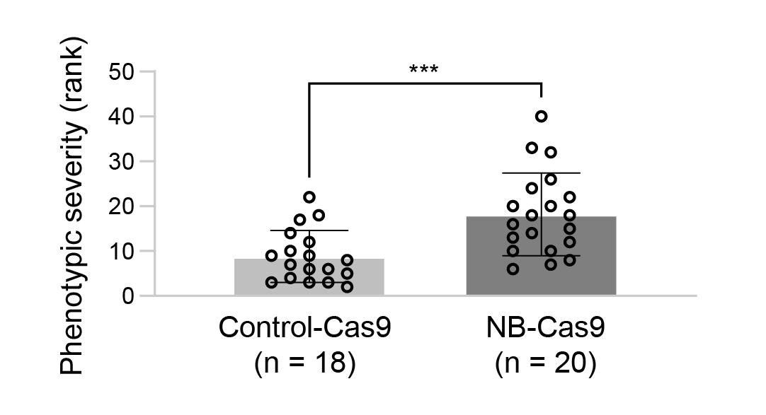
This audience may include grant reviewers, laboratory members, and academic committees. These groups will often require detailed information in your graphs with clear designs that help communicate the research results. If your visualization is targeting the scientific audience, you may need to choose graph types that allow for details such as statistical significance, number of subjects, and comparisons to controls.
Common Scientific Data Visualizations:
- Bar Graphs
- Line Graphs
- Box and Whisker Plots
- Scatter Plots with Bars
- Heat Maps
- Scientific Illustrations
Business Audience
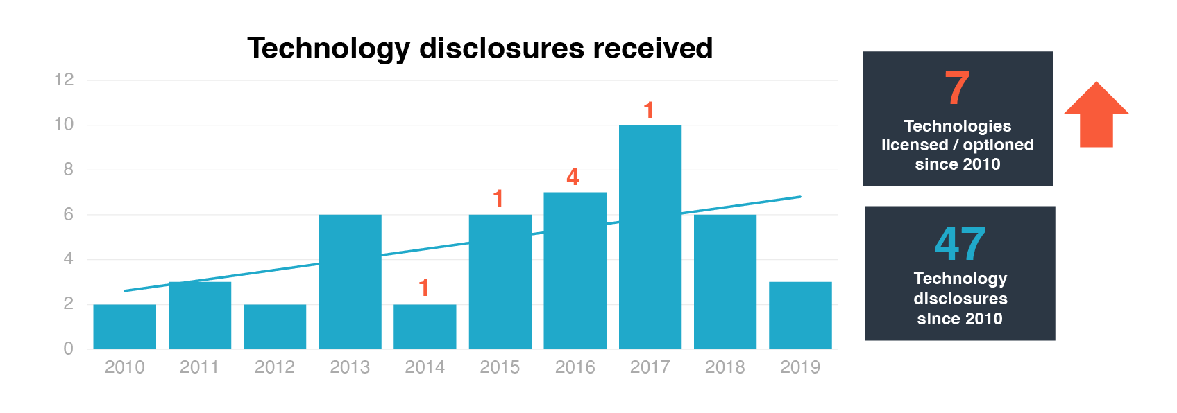
The business audience may include tech, biotech, and pharmaceutical companies. This audience uses data to inform their business decisions and you should choose eye-catching graphs that quickly show the most important conclusions of the dataset. This can include additional graphic designs that show the main point of the data such as arrows or numbers that stand out from the image.
Common Business Data Visualizations:
- Bar Graphs
- Line Graphs
- Pie Charts
- Tables
- Graphs with additional graphic designs (such as arrows, large numbers, etc.)
Public Audience
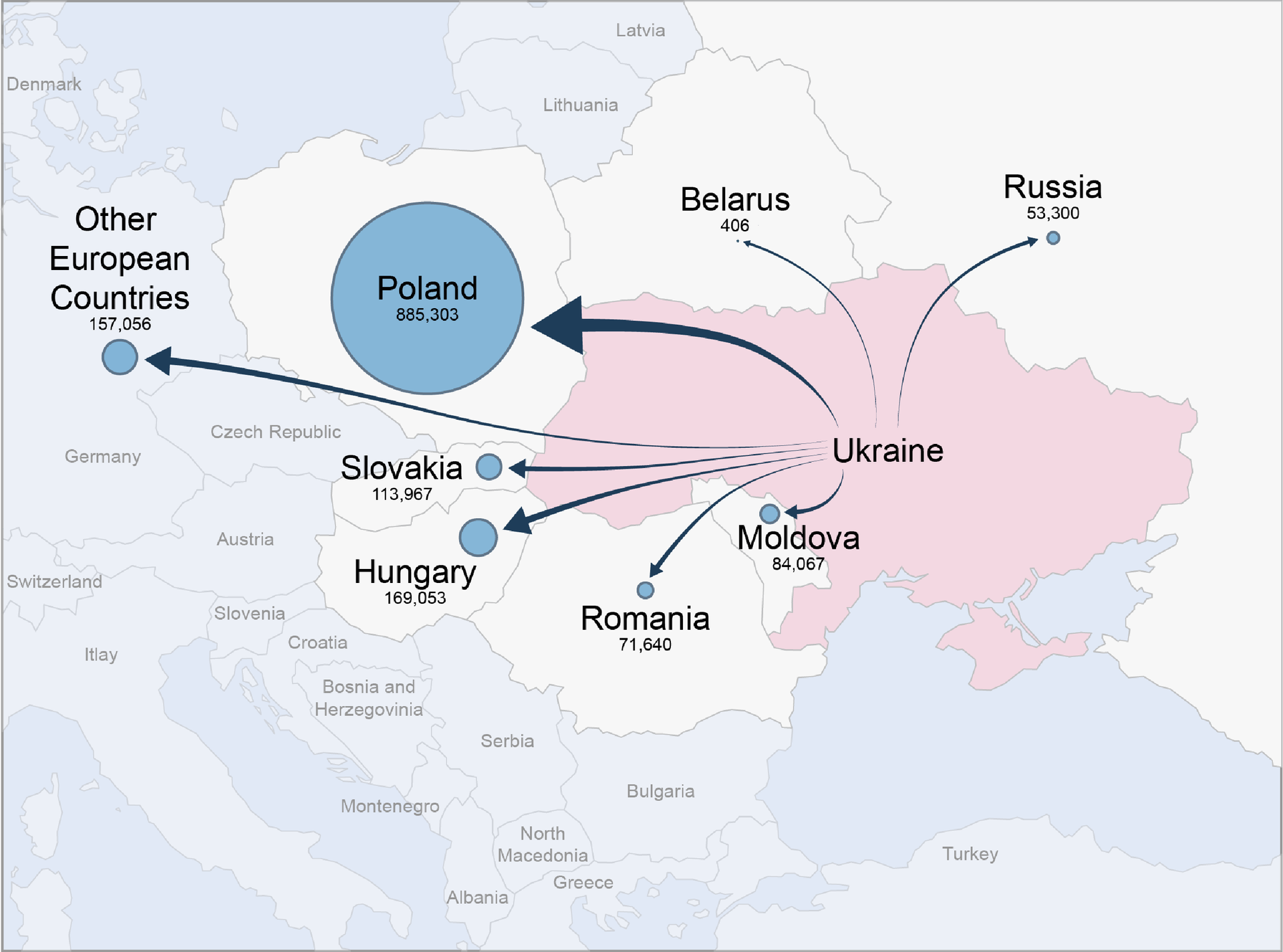
A public audience responds best to simple information presented in an engaging way, so you will likely want to choose graphs that limit detail and focus on the big picture of the data story. This can include using illustrations, maps, and infographics that show the results without having to read the details or text.
Common Public Data Visualizations:
- Infographics
- Pie Charts
- Bar Graphs
- Maps
- Diagrams
- Videos
- Illustrations
Tool #4: Data Storytelling Framework
Using a data storytelling framework is another great tool that can be used to create effective data visualizations. Stories contain four main elements: characters, setting, conflict, and resolution. Below is an example of how these elements can be used to tell a story about a biotech product. Read the article linked below to learn more about a data storytelling framework that can help you create better data visualizations:
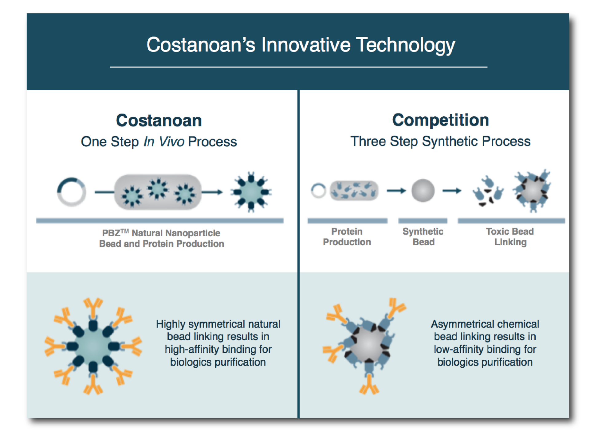
Data Storytelling Example: Let’s set the scene: a company has a new product that improves biologics purification with a one-step process. The characters in this case are the product and the purification elements, the setting is the purification process, the conflict is the performance of the product compared to competitors, and the resolution is the better performance of the company product. Together, these can be used to help design a graphic that highlights the biotech product hero’s journey (see example).
Data Visualization Tools Summary
Regardless of which method you use, each of the four tools listed below provide helpful frameworks for you to transform complex data into clear and compelling graphics.
- Create a Data Purpose Checklist - Define the main purpose of the data to keep your overall communication goal clear.
- Review Data Visualization Examples - Look at example graphs to help you highlight the purpose of the data.
- Identify Target Audience - Create visualizations that appeal to a specific audience.
- Use Data Storytelling Techniques - Create a design that tells a compelling story.
Reference
- Ukraine refugee arrivals open source data used for my map visualization is from the UNHCR database on March 3-5, 2022: https://data2.unhcr.org/en/situations/ukraine
Create professional science figures with illustration services or use the online courses and templates to quickly learn how to make your own designs.
Interested in free design templates and training?
Explore scientific illustration templates and courses by creating a Simplified Science Publishing Log In. Whether you are new to data visualization design or have some experience, these resources will improve your ability to use both basic and advanced design tools.
Interested in reading more articles on scientific design? Learn more below:
Content is protected by Copyright license. Website visitors are welcome to share images and articles, however they must include the Simplified Science Publishing URL source link when shared. Thank you!
