

Best Color Palettes for Scientific Figures and Data Visualizations
Learn More About Simplified Science PublishingChoosing the right colors for your data visualizations improves audience comprehension and makes your work accessible to people with color blindness. Color is also an important element of designing scientific graphs and data visualizations because it is a powerful storytelling tool.
Below is a comprehensive guide that will help you create your own effective scientific color palettes and provides resources to help you apply the selected colors in different data visualization platforms.

What is a Color Palette and Why Should I Care?
A color palette is a set of colors that you use within a visual. For scientific purposes, using a carefully selected color palette can be a powerful tool that helps you tell your scientific story. For example, the use of blue and red on a heat map makes the audience think hot (increase) and cold (decrease), the use of green and brown on a map can tell a story of rainfall impacting farmland fertility, and having one color stand out from the others on a graph can highlight the main point of your research results.
It is also important to use an accessible color palette that doesn’t confuse people with Color Vision Deficiencies (CVD), also known as color blindness. Approximately 1 in 12 men and 1 in 200 women experience different forms of CVD, so it is a common occurrence that requires understanding which color combinations are hard for people to distinguish.

How to Find the Best Scientific Color Combinations
Choosing opposing colors on the color wheel are some of the best color combinations. These colors can help people understand your data story and are also the most accessible for people with color blindness and other color perception difficulties. However, it is important to note that you should not feel limited by only using these options.

Use Color Saturation and Lightness to Create Contrast
You can use any combination of colors as long as they are highly contrasting, even if they are different shades of the same color. The three main color characteristics are hue, saturation, and lightness. You can adjust any three of these characteristics to create an effective scientific color palette using any colors that best represents your dataset.

In order to test which colors are best for your scientific project and keep them uniform across platforms, you need to know that every color is defined by different kinds of codes. The main color code that you need to know for scientific publications and presentations are “HEX” codes, which are a six-digit codes that you can use to identify the exact colors that you want to keep consistent across design tools such as Adobe Illustrator, Excel, PowerPoint, Prism, Google Slides, websites platforms, etc. You may also need to know the RGB, HSL, or CMYK color codes for different graphing and data visualization tools.
To find different color codes, I recommend that you use the tools below:
- Toptal Color Platte Tool - Use this color tool to create, visualize, and download custom, monochrome, analogic, complementary, triad, and quad HEX code color palettes: https://www.toptal.com/designers/colourcode.
- Google Color Picker - Online tool where you can use a color slider to find the HEX, RGB, CMYK, and HSL color codes: https://g.co/kgs/qDGrn3rn3.
- Image Color Picker - Online tool where you can upload an image or provide a website URL and get the RGB Color, HEX Color and HSL Color codes from the image: https://imagecolorpicker.com/en.
- Your Graphing System - Use color formatting tools in your graphing software such as Excel, Prism, R, MATLAB, etc. These tools may not show the color codes, but most will allow you to use an eye dropper tool to select your desired colors from a color palette image.
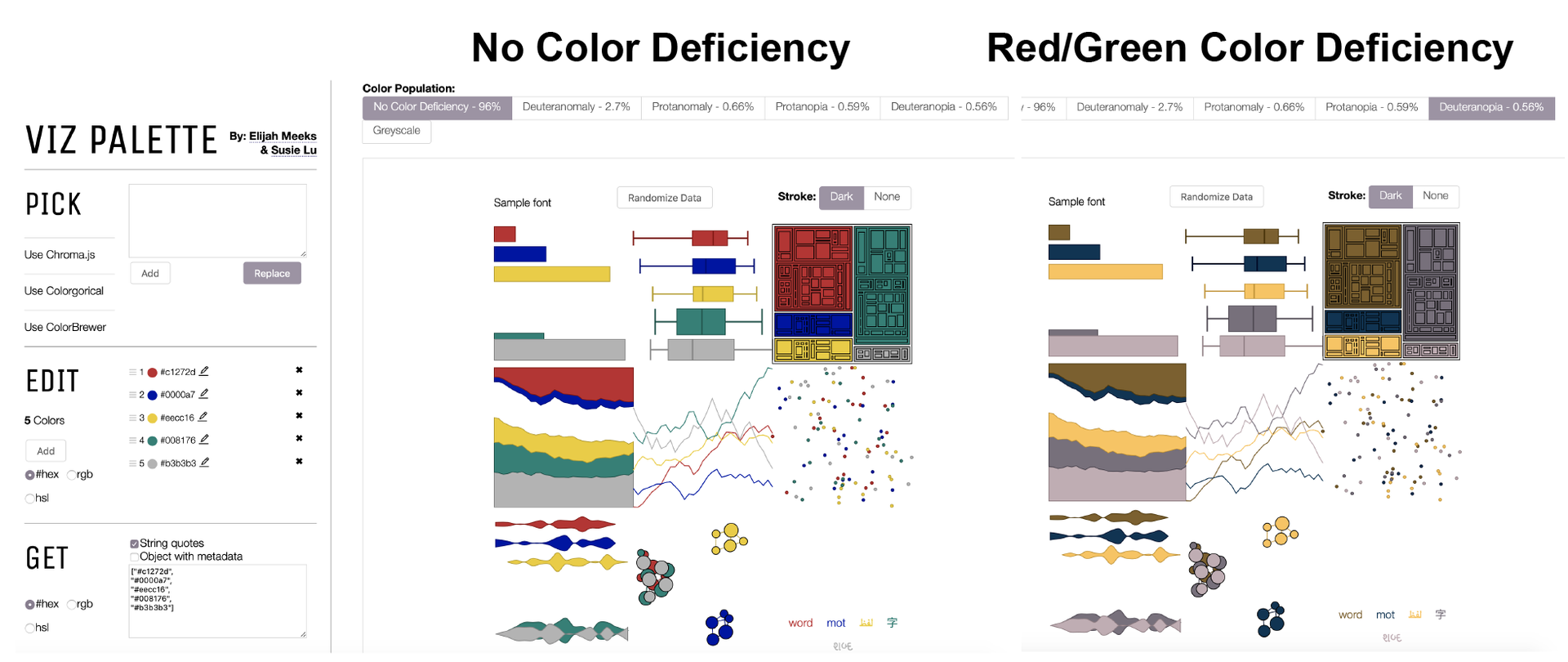
Use the Viz Palette Tool to Test for Color Accessibility
After you choose a potential color palette for your scientific graphs, posters, or presentations, I recommend that you check whether your colors are accessible to people with all types of color blindness using a fantastic tool called "Viz Palette" by Elijah Meeks & Susie Lu: https://projects.susielu.com/viz-palette.
The Viz Palette tool allows you to enter the HEX, RGB, or HSL color codes in the Edit panel and then test how people with different types of CVD will see the colors. The example below shows how the tool allows you to see what a set of colors looks like to a person with red/green color blindness and also shows the gray scale view. If your chosen color palette is not fully accessible, you can make adjustments to some of the color's hue, saturation, and lightness until it meets the tools requirements for the fewest color conflicts.
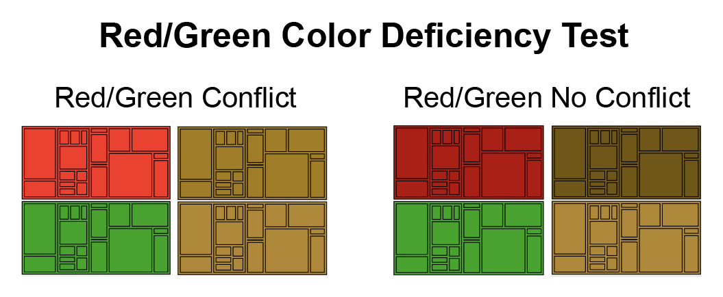
One incorrect thing I have heard designers say is to “never use red and green together.” They say this because red and green have the most color conflicts for people with color blindness. However, if it is important to your data story, you can use red and green colors together as long as you apply different saturation and lightness to increase the contrast. (See example where high contrasting red and green colors can be used together without a conflict).
Accessible Color Palettes for Charts and Graphs
The best color palettes for data visualizations are accessible to a wide audience and have clear data storytelling. The examples below provide color combinations and hex codes for a variety of bar charts, line graphs, and pie charts that work well for scientific publications. These examples include hex codes and provide options for sequential, qualitative and divergent color palettes.
Two Color Combinations for Bar Graphs

Three Color Combinations for Bar Graphs

Four Color Combinations for Charts

Six Color Combinations for Charts

Eight Color Combinations for Charts

Color Guides for Data Visualization Platforms
Data visualization platforms have different options for applying color and using the color codes. Below are resources to help you apply the best colors for graphing platforms such as Adobe Illustrator, Excel, R, Tableau, MATLAB, and Map Generators.

Color Palette Tools in Microsoft Excel and PowerPoint
- There are many different versions of Microsoft Excel and PowerPoint, but most of them have an "eye dropper" tool in the color formatting section that allows you to select any color that is available on your screen. This is helpful if you want pull colors from an example image, such as your institution's logo, an example color palette image, or an image with your predefined HEX code colors.
- Some versions of Microsoft will also allow you to directly enter the HEX code in the color formatting settings.
- To find which color tools are available for your version of the software, select the graph, text, or shape element that you want to change using "CRTL + Click" or the Right Click on your mouse and select the color formatting options from the menu options that appear.

Color Palettes in R
- To see a comprehensive list of color palettes available in R, go to Emil Hvvitfeldt's GitHub Resource:
- https://github.com/EmilHvitfeldt/r-color-palettes
- To learn how to apply color in R, I recommend using the open resources available from the University of British Columbia:
https://www.stat.ubc.ca/~jenny/STAT545A/block15_colorMappingBase.html


Color Palettes in MATLAB
- MATLab uses RGB values and a color picker code (c = uisetcolor) to define colors.
- Below are two resources that can help you select the right MATLab color palettes for your graphs and visualizations:
https://www.mathworks.com/help/matlab/ref/uisetcolor.html
http://math.loyola.edu/~loberbro/matlab/html/colorsInMatlab.html


Color Palettes for Scientific Poster Backgrounds
Tool to Translate a Color into Any Format
- Use this Color Hex tool to find all of the color codes from a HEX color code such as RGB, HSL, CMYK, and many others: https://www.rapidtables.com/convert/color/index.html.
- This may be helpful if you need to translate your desired colors to a software or graphing platform that uses a less common color code.
How to Use Color to Tell your Scientific Story
Read these articles to learn more scientific story design tips and tricks:
- Scientific Data Visualization Tools and Techniques
- Data Storytelling: How to Tell a Great Data Story in 4 Steps

Grayscale is a Good Default Option
Although color can be used as an effective tool to tell your data story, it is also important to note that grayscale colors are still a great way to represent your data. The key to using grayscale in scientific research is to make sure that there is approximately a 15-30% difference in saturation between the colors used (e.g. shades of gray). Most default color guides are already set up to help you select gray colors that are not too similar.

Science Color Palette Summary
All of the tools described in this article can help you find and apply the right colors for your data visualizations and scientific figures. Now that you have all of the resources you need, you can use the simple process below to create your own scientific color palette:
How to Choose the Best Scientific Color Palette:
- Step 1. Choose a color palette that looks good to you and best represents your data. Use the information in this article to help you make good initial choices.
- Step 2. Test the colors in the Viz Palette tool to see how they will affect a color blind audience.
- Step 3. Adjust color, hue and saturation in the Viz Palette until there are no color conflicts.
- Step 4.
Apply the final colors to your data visualization platform, scientific papers, posters, and graphs that highlights the main point of your data.
References:
- Statistic of number of people with CVD from https://www.colourblindawareness.org/colour-blindness/
Create professional science figures with illustration services or use the online courses and templates to quickly learn how to make your own designs.
Interested in free design templates and training?
Explore scientific illustration templates and courses by creating a Simplified Science Publishing Log In. Whether you are new to data visualization design or have some experience, these resources will improve your ability to use both basic and advanced design tools.
Interested in reading more articles on scientific design? Learn more below:


Content is protected by Copyright license. Website visitors are welcome to share images and articles, however they must include the Simplified Science Publishing URL source link when shared. Thank you!