

Best Graphical Abstract Examples with Free Templates
Learn More About Simplified Science PublishingCreating engaging graphical abstracts can improve scientific publication rates and allows you to easily share your research in presentations and social media.
Graphical abstracts are becoming increasingly essential science communication tools for presentations and publications. Many academic journals now require scientists to submit graphical abstracts and the rise of social media has made summary images a standard expectation for communicating complex information. This article shows well-designed graphical abstract examples and also provides links to free templates.

What is a Graphical Abstract?
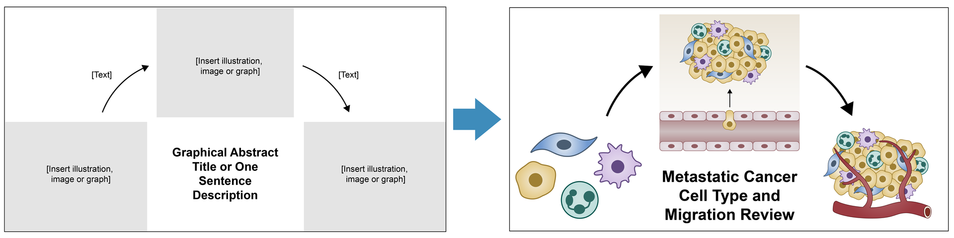
A graphical abstract is a visual representation of a research project. The goal of the abstract is to create a clear story of your scientific method and results that is quickly understood by your audience. The best graphical abstracts use a combination of data, illustrations, and formatting to make it easy to follow the main points of the research. Below is an example of a well-designed graphical abstract that uses left-to-right formatting to show the gathering initial data from TBI patients, treating patients with two treatment paths, and patient outcomes.

Graphical Abstract Examples
One great way to start brainstorming for your own graphical abstract is to look at examples to see which ideas and formats might best fit your own research story. Below is a review of the best graphical abstract examples, as well as links to download these free templates for your own designs.
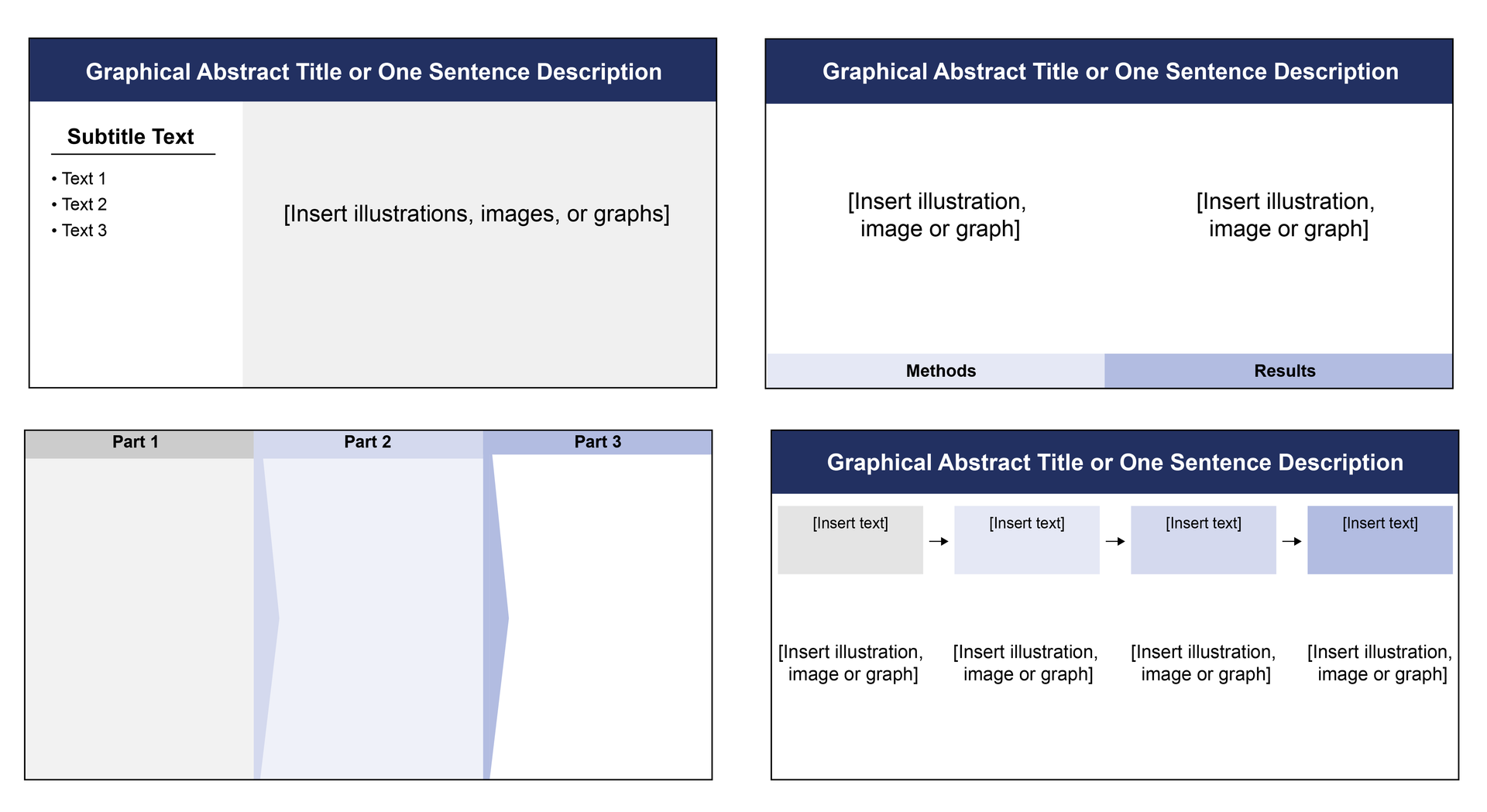
Left-to-Right Designs
My top recommended graphical abstract design uses bold title text with left-to-right formatting for the details below it. This format is easy for people to understand and can be used to compare methods to results, describe a sequence of events, or show a series of scientific conclusions. Below are examples of my recommended left-to-right designs with 1-4 columns.
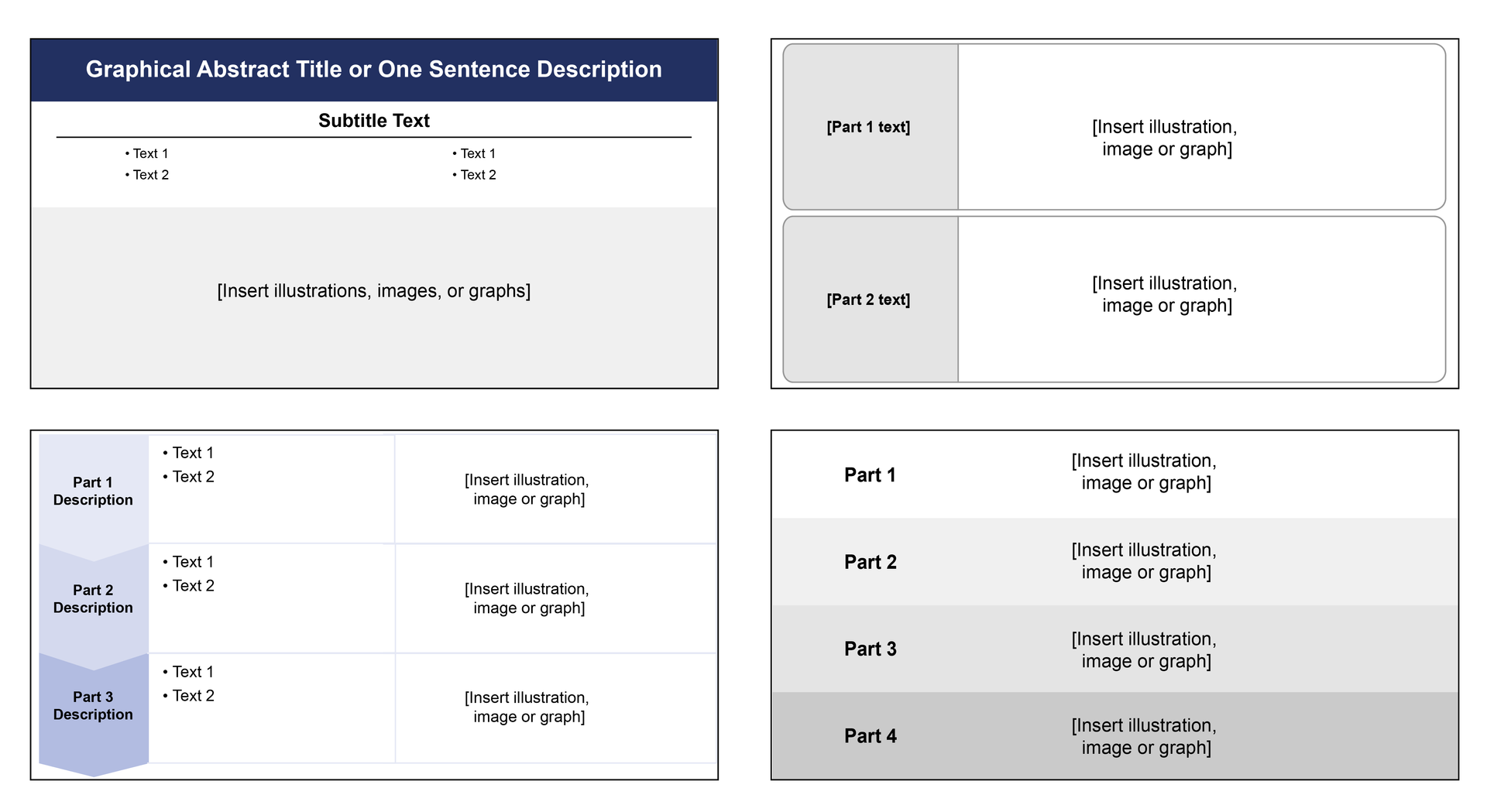
Top-to-Bottom Designs
Another good option is to use a top-to-bottom formatting. This is an especially good design idea if your data output goes from a large quantity to a small quantity or if the research results naturally go from top to bottom, such as north to south on a map or from the atmosphere to the Earth. Below are examples of top-to-bottom graphical abstract designs with 1-4 rows.
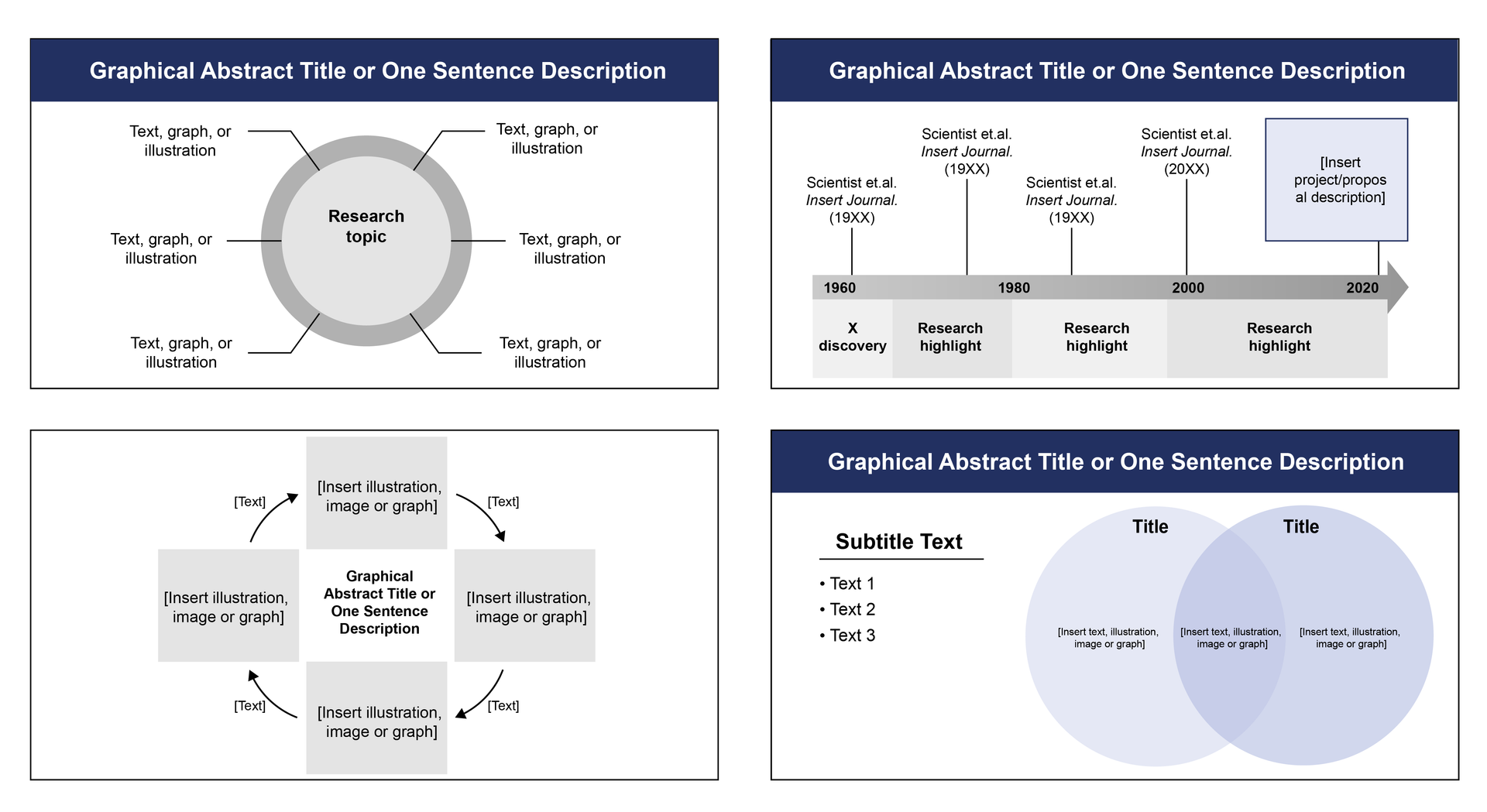
Circular and Unique Graphical Abstracts
The final recommended formats are circular and unique formats such as timelines and Venn diagrams. These are less commonly used and should only be selected if the summary of your research is easier to understand using one of these designs than the left-to-right formatting.
Design Tools to Customize Graphical Abstracts
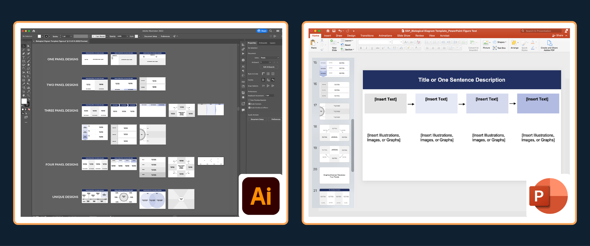
Knowing how to use design tools to create custom graphical abstracts has become an increasingly essential skill for researchers. Below is an example of a graphical abstract design that was customized using biological diagram templates and a list of the top design tools that scientists use to create graphical abstracts and scientific illustrations.
Adobe Illustrator
- Top recommended software for advanced scientific and graphic design. This is the digital design tool used by most professional scientific illustrators.
- This tool allows for full customization of graphical abstracts by creating high resolution vector designs where every pixel can be adjusted to make the perfect final design.
- Learn more about how to get Adobe Illustrator as a student or scientist.
- Costs: $240-252 for annual subscription
Affinity
- Design software that is similar to Adobe Illustrator but with slightly fewer design features. This is a great free alternative to Adobe Illustrator.
- This tool allows for customization of graphical abstracts by creating high resolution vector designs where every pixel can be adjusted to make the perfect final design.
- Visit here to purchase the software: https://www.affinity.studio/
- Cost: Free with Canva

PowerPoint
- PowerPoint is a commonly used software for scientists and has become increasingly good at allowing researchers to make custom designs using their shapes, lines and arrow features.
- This tool has limited design features, but these are not always needed if you know how to use PowerPoint well.
- Visit this page to learn more about purchase options.
- Cost: Free versions and $70-160 for full software
- Google Slides and Google Drawing are comparable tools to Microsoft PowerPoint. Scientists do not use these as often as PowerPoint, but it is still a good software to use if you are more familiar with Google products.
- The design features are limited compared to Adobe Illustrator and Affinity Designer, but you can still use this software to create high quality graphical abstracts.
- Cost: Free with Google account
There are also tools such as BioRender that allow you to create graphical abstracts with images that you can copy/paste into designs. However, this tool has limited customization options and is very expensive if you want to download your work as high resolution images that are used for publications and presentations. Read this article to learn more about the costs, pros, and cons of popular scientific design tools.
Use Graphical Abstracts to Promote Research
There are many different options to share your research with the public and your peers. Having a well-designed graphical abstract makes it easy to format the designs to share via presentations, scientific websites, and social media. This is a great way to increase interest in and awareness of scientific research.
In order to share your graphical abstract via social media, you may need to adjust your designs so that the image can be best formatted for different platforms. Each social media platform has their own preferred dimensions for the images you share. For example, if you want to share your graphical abstract on both Instagram and LinkedIn, you will want to adjust one version to fit a square image for Instagram and you probably won't need many adjustments to share a landscape image on LinkedIn. Below are examples of graphical abstract image formatting for social media posts on Instagram, LinkedIn, Facebook, and Twitter.

Graphical Abstract Design Summary
All of the examples and tools described in this article can help you design impressive graphical abstracts and share them with a wider audience. Use the simple process below to start your own design.
- Step 1. Choose a design plan that looks good to you, best represents your data, and matches your intended scientific journal's formatting requirements.
- Step 2. Create a draft of your design by drawing on paper or use digital design tools such as Adobe Illustrator, Affinity Designer, or PowerPoint to arrange your illustrations, text, and graphs. Learn more about graphical abstract design options by clicking on the resources below:
- Download free graphical abstract templates and view other science images
- Sign up for free courses on graphical abstract and scientific illustration
- Step 3. Adjust the design formatting and colors until the main story of your research is clear.
- Read articles to learn more about data visualization design best practices and data storytelling
- Step 4. Share with scientists and the public via presentations, scientific websites, and social media.
Create professional science figures with illustration services or use the online courses and templates to quickly learn how to make your own designs.
Interested in free design templates and training?
Explore scientific illustration templates and courses by creating a Simplified Science Publishing Log In. Whether you are new to data visualization design or have some experience, these resources will improve your ability to use both basic and advanced design tools.
Interested in reading more articles on scientific design? Learn more below:


Content is protected by Copyright license. Website visitors are welcome to share images and articles, however they must include the Simplified Science Publishing URL source link when shared. Thank you!