

How to Make Professional Graphical Abstracts in PowerPoint and Adobe Illustrator
Learn More About Simplified Science PublishingCreating good graphical abstracts for scientific papers requires using design best practices to make an illustrated summary that clearly shows the main point of your research.
The resources in this article provide step-by-step training on how to create professional-level illustrations for graphical abstracts and Excel graphs in PowerPoint and Adobe Illustrator. If you prefer to watch the graphical abstract tutorials instead of reading the steps, you can also sign up for free online courses using the link below.

Step 1: Download Free Graphical Abstract Templates
One of the easiest ways to create good graphical abstracts is to start with a template that provides the correct size and framework that makes it easy for you to make an effective design. Use this link to download twenty-four free graphical templates for PowerPoint and Adobe Illustrator. These include templates formatted for Elsevier journals.


Step 2: Choose a Template that Supports Your Data
After you download the graphical abstract templates, the next step is to choose a design that shows the main points of your scientific story. For example, if you want to highlight the methods and results of your research, you may want to choose a templates from the two panel designs. If your data has multiple concepts or results, then you may want to choose a four panel or unique template design.
My recommended way to choose a template is to sketch a draft on pen and paper to see how many sections you will need to best describe your research. The examples below show two graphical abstract design brainstorms with options for two panel and three panel templates.
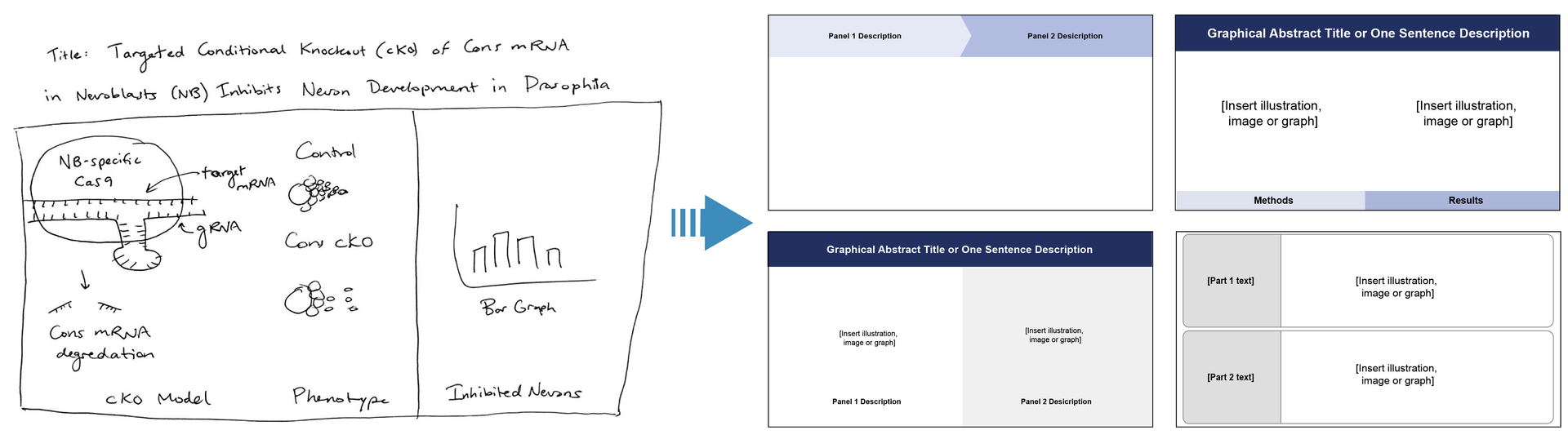
Two Panel Example
The brainstorm image below shows good graphical abstract design options based on a concept that shows two main panels: the conditional knockout model/phenotype and the experiment bar graph results.
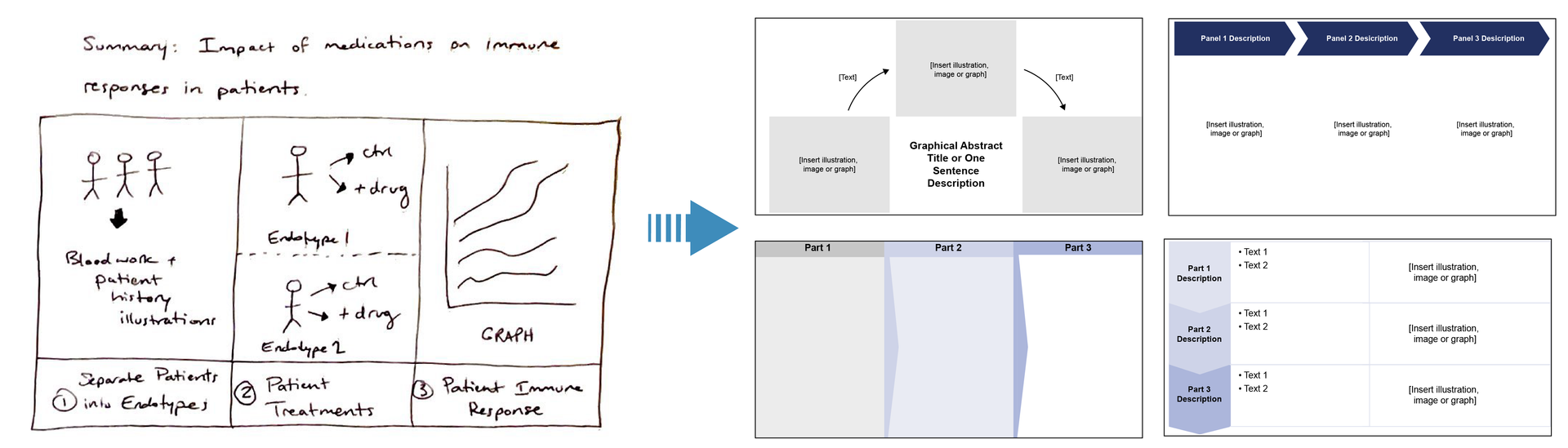
Three Panel Example
The image below shows good graphical abstract design options based on a concept that shows three distinct panels: 1) separating patients into groups, 2) giving treatment to the patients, and then 3) showing the treatment results in a graph.
Resize the Graphical Abstract to Match Journal Requirements:
In order to format the graphical abstract for scientific publication, you will also need to know the requirements of the scientific journal. Make sure to find the maximum width, heights, fonts, resolution, and file type requirements for the graphical abstract.

You can find different journal requirements by going to the Journal’s homepage and then finding the link to the graphical abstract guidelines from there. If you Google the journal’s graphical abstract requirements, make sure you find the most up-to-date page on the website.
For example, Elsevier academic journals require that graphical abstracts are 1328 x 531 pixels. In contrast, most other journals require that it matches the maximum figure sizes of approximately 180 mm width (double column on a regular sheet of paper). Make sure to check the specifications before moving on to the next step of adding designs and data to avoid having to reformat the file.
If you still aren't sure how you want to organize your graphical abstract information, read these articles for more insights on how to represent your data:
- Scientific data visualization techniques
- Scientific data storytelling
- Examples of graphical abstracts
Step 3: Add Designs and Data to the Graphical Abstract
After you have your graphical abstract template saved as your draft document, the next step is to add the designs, data, and text. No matter which design software you are using, there are three main methods you can use to create the graphical abstract design.
Recommended Methods to Add Designs and Data to Graphical Abstracts:
- Download customizable images and template designs that have appropriate copyright rules.
- Download images from online databases such as Simplified Science Images
- Make sure that the images have high resolution and are permitted for use in scientific publications without attribution.
- Draw your own illustrations.
- Draw illustrations using Adobe Illustrator, Affinity Designer, PowerPoint, Inkscape, Google Draw, or other design tools
- Build your skills with free online courses and digital illustration workshops
- Import and optimize graphs from software such as Excel, GraphPad Prism, etc.
- Graphing software have a lot of design options that will allow you design and export graphs that match your graphical abstract color, size, and spacing.
Step 3: Add Designs and Data to the Graphical Abstract
After you have your graphical abstract template saved as your draft document, the next step is to add the designs, data, and text. No matter which design software you are using, there are three main methods you can use to create the graphical abstract design.
Recommended Methods to Add Designs and Data to Graphical Abstracts:
- Download customizable images and template designs that have appropriate copyright rules.
- Download images from online databases such as Simplified Science Images
- Make sure that the images have high resolution and are permitted for use in scientific publications without attribution.
- Draw your own illustrations.
- Draw illustrations using Adobe Illustrator, Affinity Designer, PowerPoint, Inkscape, Google Draw, or other design tools
- Take courses in scientific design
- Import and optimize graphs from software such as Excel, GraphPad Prism, etc.
- Graphing software have a lot of design options that will allow you design and export graphs that match your graphical abstract color, size, and spacing.

Step 4: Export Files for Scientific Publications and Presentations
After your graphical abstract design complete, the final step is to export the file for your scientific publication, presentations, and posters. Every design tool will have different settings for exporting different file types. Below are my recommended export tips for commonly used graphical abstract design tools:
Adobe Illustrator: Save the graphical abstract as a TIFF, EPS or PDF file for publication and as a large PNG for presentations and posters. Make sure you only export the artboard that has the proper dimensions and use RGB color settings and 300 ppi (pixels per inch).
PowerPoint: Save the files as a TIFF for publications and as a PNG for presentations. Make sure you increase the width to at least 2000 using the Page Setup settings to ensure that the file has a high resolution.
Affinity Designer: Save the graphical abstract as a TIFF, EPS or PDF file for publication and as a large PNG file for presentations and posters. Use RGB color settings and 300 ppi (pixels per inch) for a high resolution file.
Graphical Abstract Design Summary
Graphical abstracts are an increasingly important communication tool for scientists. This article reviewed four steps to help researchers create impressive designs:
Step 1. Download free graphical abstract templates
Step 2. Choose a template that best supports your data story
Step 3. Add designs and data to the graphical abstract
Step 4. Export high resolution files for publications, presentations, and posters.
Create professional science figures with illustration services or use the online courses and templates to quickly learn how to make your own designs.
Interested in free design templates and training?
Explore scientific illustration templates and courses by creating a Simplified Science Publishing Log In. Whether you are new to data visualization design or have some experience, these resources will improve your ability to use both basic and advanced design tools.
Interested in reading more articles on scientific design? Learn more below:


Content is protected by Copyright license. Website visitors are welcome to share images and articles, however they must include the Simplified Science Publishing URL source link when shared. Thank you!