
Scientific illustration program using free Affinity software

Scientific Illustration & Figure Design Workshop

Advance your design skills with live trainings, templates, and certification. Learn more here!

ONE-HOUR CONFERENCE WORKSHOP

Scientific Figure Design Workshop

One hour workshop - Customized to meet your conference goals

  • Learn the four rules of good scientific design
  • Get expert tips on what types of graphs and data visualizations are best for different scientific questions
  • Explore tools that can help you design good data visualizations for graphs, scientific figures, and scientific illustrations.
  • Practice drafting your own science figure using a guided worksheet exercise
Scientific Figure Workshop outline

Workshop Highlights

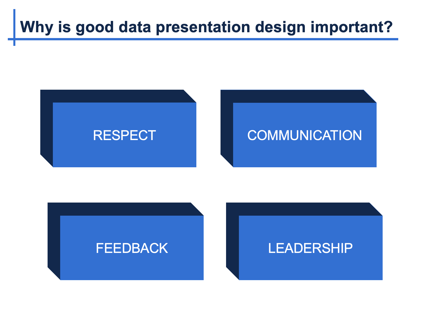
Data presentation design workshop introduction slide

Learning Objectives

By the end of the workshop, participants will be able to:

 • Prepare engaging introductions for data-focused presentations


• Create quick and effective presentation outlines that identify and highlight the main point


• Use essential tools such as space, color, contrast, text and animations within Excel and PowerPoint to create clear data visualizations 


• Design presentations that enhance audience attention and comprehension


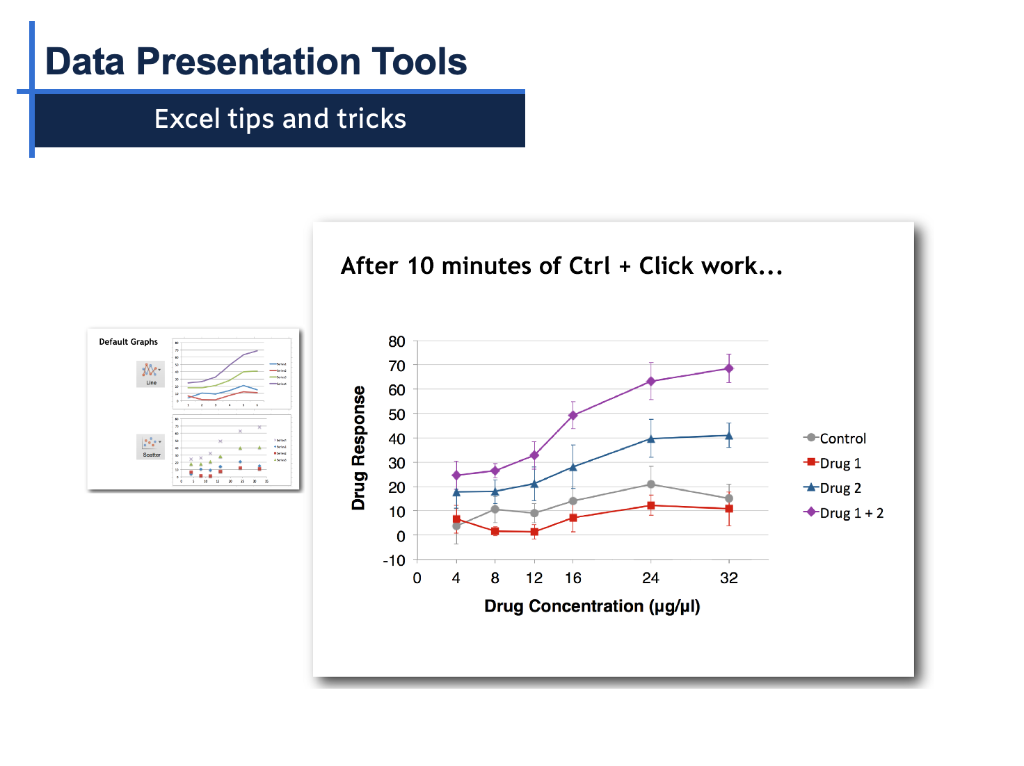
Excel graph optimization example from the workshop

Workshop Overview

Part 1. Engage your audience: Learn scientifically proven methods to earn your audience's attention and improve their comprehension.


Part 2. Identify and Illustrate Your Main Point 

Guided exercises to design an engaging data presentation that effectively communicates the main point that you want the audience to adapt.


Part 3. Data Visualization and Slide Design

  • Space, contrast, color, text, images, animations, and data visualizations.
  • Excel and PowerPoint tips and tricks: shortcuts, templates, alignment, groups, arrangement, crops and shapes.
  • Introduction to additional presentation and data visualization tools
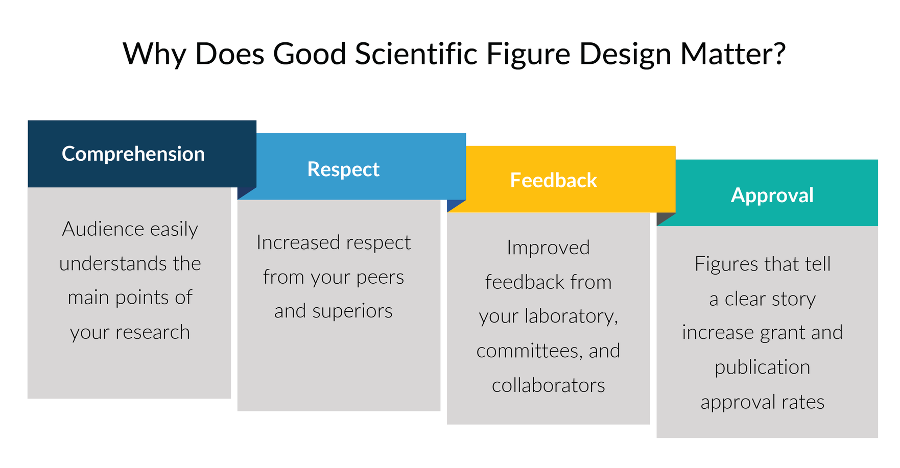
Why good scientific design matters

Learning Objectives

By the end of the workshop, participants will be able to:

 • Clearly show the main points of your project(s) to the audience


• Use composition to simplify the information in your scientific designs


• Use color and grayscale to highlight the most important ideas


• Apply a refine and repeat process to make your data story clear


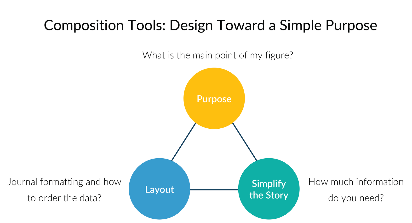
Composition tools examples for science figures

Workshop Overview

Four Rules of Good Scientific Design: Learn graphic design best practices that you can apply to your science posters, figures, and presentations.


Simplify the Information: Examples of how to simplify complex information and highlight the main points using design best practices.


Color Design: Tools and tips for using color design to make your data visualizations accessible to people with color vision deficiencies and to make the most important information stand out.


Workshop: Guided exercise and worksheet to apply the four rules of good scientific design to your own project.


Conference Workshop Highlights

Why good scientific figure design matters

Learning Objectives

By the end of the workshop, participants will be able to:

 • Clearly show the main points of your project(s) to the audience


• Use composition to simplify the information in your scientific designs


• Use color and grayscale to highlight the most important ideas


• Apply a refine and repeat process to make your data story clear


Composition tools examples for figures for publication

Workshop Overview

Four Rules of Good Scientific Design: Learn graphic design best practices that you can apply to your science posters, figures, and presentations.


Simplify the Information: Examples of how to simplify complex information and highlight the main points using design best practices.


Color Design: Tools and tips for using color design to make your data visualizations accessible to people with color vision deficiencies and to make the most important information stand out.


Workshop: Guided exercise and worksheet to apply the four rules of good scientific design to your own project.


Karen Thiebes course instructor photo

Workshop Instructor

Dr. Karen Thiebes is a professional scientific illustrator and has a Ph.D. in Neuroscience. She has led scientific design courses for over 10 years and enjoys teaching participants how to quickly transform data into effective designs using Affinity, Adobe Illustrator, CorelDRAW, PowerPoint, and Excel. She is also an Affinity Education Leader who supports improving the accessibility to design software and training for everyone.

Access All Advanced Online Courses

Simplified Science Pro users receive unlimited access to all of the free and advanced courses for only $59. New online courses are added every year to stay up-to-date with the latest scientific design techniques and includes access to live trainings called Adobe Illustrator Learning Labs. The Pro courses also include scientific templates such as the popular Biological Diagram and Laboratory Tool templates with over 400 illustrations that you can use in your own scientific designs. Learn more here!