LIVE ONLINE WORKSHOP

Data Presentation Design

(Facilitated by Oregon Bioscience Association)

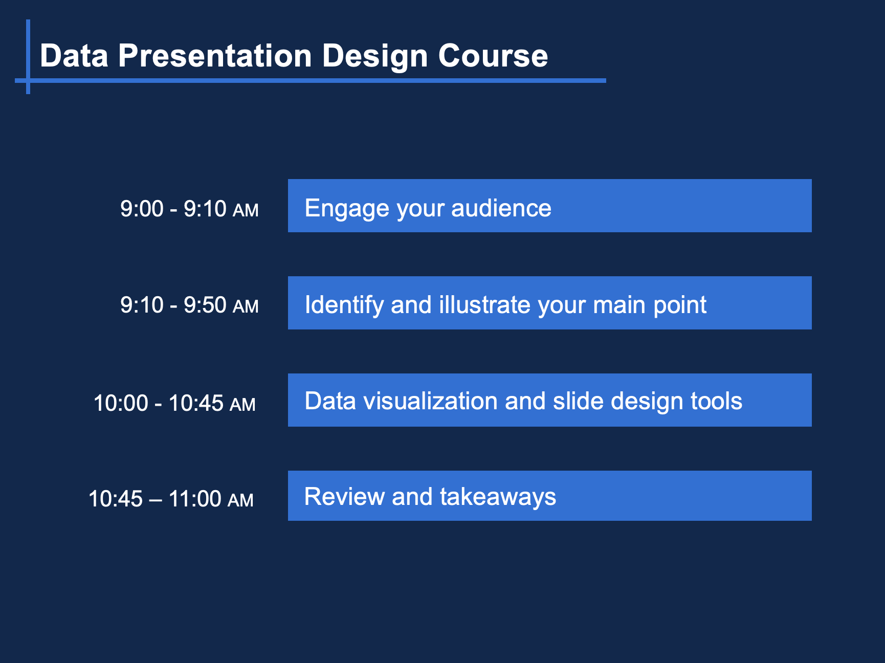
Two hour workshop - only available as a live online workshop via Zoom

  • Learn how to prepare engaging introductions to your presentations
  • Enjoy hands-on experience to brainstorm the main points of your next presentation
  • Get expert tips on how to optimize your PowerPoint slide designs
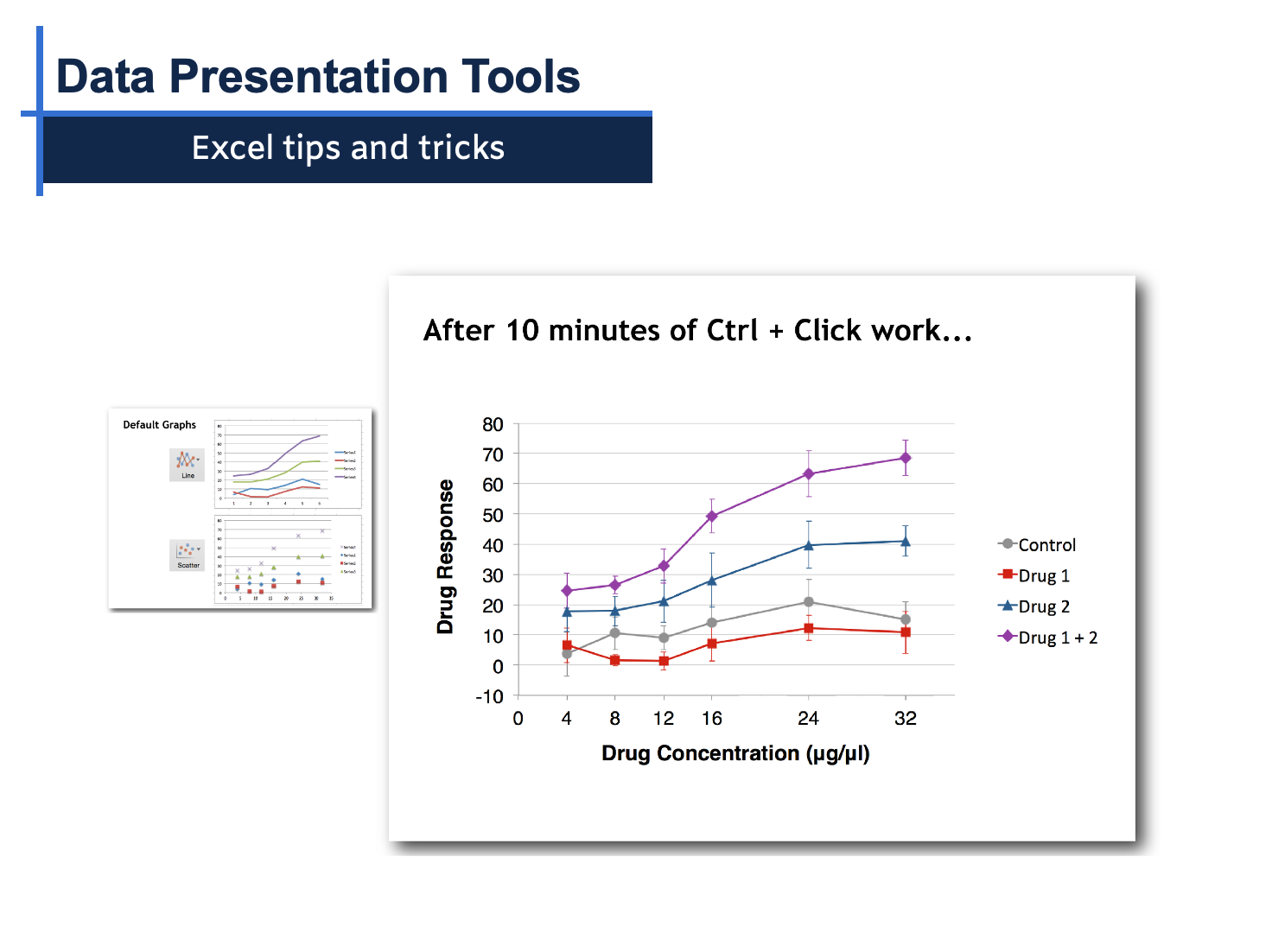
  • Create effective data visualizations using Excel
Data Presentation Design workshop outline

Workshop Highlights

Data presentation design workshop introduction slide

Learning Objectives

By the end of the workshop, participants will be able to:

 • Prepare engaging introductions for data-focused presentations


• Create quick and effective presentation outlines that identify and highlight the main point


• Use essential tools such as space, color, contrast, text and animations within Excel and PowerPoint to create clear data visualizations 


• Design presentations that enhance audience attention and comprehension


Excel graph optimization example from the workshop

Workshop Overview

Part 1. Engage your audience: Learn scientifically proven methods to earn your audience's attention and improve their comprehension.


Part 2. Identify and Illustrate Your Main Point 

Guided exercises to design an engaging data presentation that effectively communicates the main point that you want the audience to adapt.


Part 3. Data Visualization and Slide Design

  • Space, contrast, color, text, images, animations, and data visualizations.
  • Excel and PowerPoint tips and tricks: shortcuts, templates, alignment, groups, arrangement, crops and shapes.
  • Introduction to additional presentation and data visualization tools

Workshop Highlights

Data presentation design workshop introduction slide

Learning Objectives

By the end of the workshop, participants will be able to:

 • Prepare engaging introductions for data-focused presentations


• Create quick and effective presentation outlines that identify and highlight the main point


• Use essential tools such as space, color, contrast, text and animations within Excel and PowerPoint to create clear data visualizations 


• Design presentations that enhance audience attention and comprehension


Excel graph optimization example from the workshop

Workshop Overview

Part 1. Engage your audience: Learn scientifically proven methods to earn your audience's attention and improve their comprehension.


Part 2. Identify and Illustrate Your Main Point 

Guided exercises to design an engaging data presentation that effectively communicates the main point that you want the audience to adapt.


Part 3. Data Visualization and Slide Design

  • Space, contrast, color, text, images, animations, and data visualizations.
  • Excel and PowerPoint tips and tricks: shortcuts, templates, alignment, groups, arrangement, crops and shapes.
  • Introduction to additional presentation and data visualization tools
Karen Thiebes course instructor photo

Course Instructor

Karen Thiebes is a professional scientific illustrator and has a Ph.D. in Neuroscience from Oregon Health & Science University. She has led scientific design courses for over 7 years and enjoys teaching participants how to quickly transform data into effective designs using Adobe Illustrator, PowerPoint, Affinity Designer, and Excel.

Access All Advanced Online Courses

Simplified Science Pro users receive unlimited access to all of the free and advanced courses for only $59/year (less than $5/month). New online courses are added every year to stay up-to-date with the latest scientific design techniques and includes access to live trainings called Adobe Illustrator Learning Labs. The Pro courses also include scientific templates such as the popular Biological Diagram and Laboratory Tool templates with over 400 illustrations that you can use in your own scientific designs (a value of over $95). Learn more here!

Share by: